Project Ventoux, part 2: multiple polynomial regression on Beatport and Spotify electronic music data

Other Project Parts
Part 2 Supporting Links
Opening Thoughts
This is part two of Project Ventoux, which focuses on scaling data and finding the optimal polynomial degree by analyzing the cost curve.
The data is messy for sure but, when compared to the single linear regression of part 1, I now have models fitting the data better. If I take away points and find another y output from the much larger data set I have, I suspect more would show up at the label level. The points output restricts the data to the top 1,000-ish songs for each year. If I added low points to all those other songs on the basis of them not being a top song so they must be below the lowest points I have, the data would skew even more to the bottom.
This label versus genre dynamic is an interesting one. Genres are sorta monolithic and, in the data I've used this far, defined by Beatport. Spotify does have their own genres and there could be something in a cross platform comparison. I have beef with how Beatport lumps Melodic House and Melodic Techno together, they're really two distinct things. Additionally, Melodic Techno is just rebranded Progressive House/Trance. These are the types of things I'm working on getting the skills and the data to unpack.
I didn't do gradient descent optimization for this part because I was really focused on the scaling and cost curves. I did a simple fit after all of that to see how it does. I prefer to write out my gradient descent functions but Scikit-Learn does have SDGRegressor, which applies gradient descent to a linear regression model.
Scaling Techniques
Two Scikit-Learn techniques were chosen based on performance with outliers, according to official documentation. The data I have is heavily skewed and full of outliers; the goal is to see how the data looks with two different scalers, which will hopefully inform future model development.
My definitions for the scalers paraphrase the linked documentation. Full credit belongs to Scikit-Learn. The functions are my own code.
StandardScaler()
StandardScaler: centers the data around 0, with negative and positive values allowed. Per the official documentation, this scaler is considered sensitive to outliers.
This function takes train, validate, and test data and returns standard scaled data that can be used in polynomial regression.
def standard_scaling(x_train, x_validate, x_test, y_train, y_validate, y_test):
    x_features_scaler = StandardScaler()
    y_output_scaler = StandardScaler()

    # training
    x_train_scaled = x_features_scaler.fit_transform(x_train)
    y_train_scaled = y_output_scaler.fit_transform(y_train)

    # validation
    x_validate_scaled = x_features_scaler.transform(x_validate)
    y_validate_scaled = y_output_scaler.transform(y_validate)

    # test
    x_test_scaled = x_features_scaler.transform(x_test)
    y_test_scaled = y_output_scaler.transform(y_test)

    return x_train_scaled, y_train_scaled, x_validate_scaled, y_validate_scaled, x_test_scaled, y_test_scaled
    ```
This is how I applied it to my data. I created a copy of the baseline matrix so I could easily trace issues. After, the data goes through two rounds of splitting to get it in the desired 60/20/20 split, which includes a shuffle mechanism to ensure even distribution. I have components that split the data into x features, y outputs, and stable IDs (such as genre ID) that I don't want to scale. Once the scaling is done, the data is reassembled as one matrix to make it easier for me to keep track of. At the end, I print the shapes to confirm I got the splits I wanted.
standard_scaler_matrix = toptracks_bpmeta_matrix
standard_scaler_ids = standard_scaler_matrix[:, core_id_values]
standard_scaler_x_features = standard_scaler_matrix[:, core_x_features]

#this reshape is because I need the y target to have the same shape as the x features
standard_scaler_y_output = standard_scaler_matrix[:, core_y_target].reshape(-1, 1)

# 60/40 training/not training
x_train, x_temp, y_train, y_temp, ids_train, ids_temp = train_test_split(standard_scaler_x_features,
                    standard_scaler_y_output, standard_scaler_ids, test_size=test_validate_ratio, train_size=train_ratio, shuffle=True)

#50/50 split of not training into validate and test sets
x_validate, x_test, y_validate, y_test, ids_validate, ids_test = train_test_split(x_temp, y_temp, ids_temp,
                                                                test_size=validate_ratio, shuffle=True)


#applying scaling
x_train_standard_scaled, y_train_standard_scaled, x_validate_standard_scaled, y_validate_standard_scaled, x_test_standard_scaled, y_test_standard_scaled = standard_scaling(x_train, x_validate, x_test, y_train, y_validate, y_test)

#somewhere along the way my y values became tuples and I was over it so I'm just smashing them back to arrays here
y_train_standard_scaled = lumpnump.array(y_train_standard_scaled).reshape(-1, 1)
y_validate_standard_scaled = lumpnump.array(y_validate_standard_scaled).reshape(-1, 1)
y_test_standard_scaled = lumpnump.array(y_test_standard_scaled).reshape(-1, 1)


#reassembling data after scaling
standard_scaling_train = lumpnump.hstack((ids_train, x_train_standard_scaled, y_train_standard_scaled))
standard_scaling_validate = lumpnump.hstack((ids_validate, x_validate_standard_scaled, y_validate_standard_scaled))
standard_scaling_test = lumpnump.hstack((ids_test, x_test_standard_scaled, y_test_standard_scaled))

# Splits size check
print("train:", standard_scaling_train.shape)
print("validate:", standard_scaling_validate.shape)
print("test:", standard_scaling_test.shape)
PowerTransformer()
PowerTransformer: aapplies zero-mean, unit variance normalization to stabilize variance and minimize skewness.
This function takes train, validate, and test data and returns power transformed data that can be used in polynomial regression.
def power_scaling(x_train, x_validate, x_test, y_train, y_validate, y_test):
    x_features_scaler = PowerTransformer()
    y_output_scaler = PowerTransformer()

    #training
    x_train_scaled = x_features_scaler.fit_transform(x_train)
    y_train_scaled = y_output_scaler.fit_transform(y_train.reshape(-1, 1))

    #validation
    x_validate_scaled = x_features_scaler.transform(x_validate)
    y_validate_scaled = y_output_scaler.transform(y_validate.reshape(-1, 1))

    #test
    x_test_scaled = x_features_scaler.transform(x_test)
    y_test_scaled = y_output_scaler.transform(y_test.reshape(-1, 1))

    return x_train_scaled, y_train_scaled, x_validate_scaled, y_validate_scaled, x_test_scaled, y_test_scaled
Pretty much the same approach to apply the power transformer to my data.
power_scaler_matrix = toptracks_bpmeta_matrix
power_scaler_ids = power_scaler_matrix[:, core_id_values]
power_scaler_x_features = power_scaler_matrix[:, core_x_features]
power_scaler_y_output = power_scaler_matrix[:, core_y_target].reshape(-1, 1)

x_train, x_temp, y_train, y_temp, ids_train, ids_temp = train_test_split(power_scaler_x_features,
                    power_scaler_y_output, power_scaler_ids, test_size=test_validate_ratio, train_size=train_ratio, shuffle=True)

x_validate, x_test, y_validate, y_test, ids_validate, ids_test = train_test_split(x_temp, y_temp, ids_temp,
                                                                test_size=validate_ratio, shuffle=True)


x_train_power_scaled, y_train_power_scaled, x_validate_power_scaled, y_validate_power_scaled, x_test_power_scaled, y_test_power_scaled = power_scaling(x_train, x_validate, x_test, y_train, y_validate, y_test)

y_train_power_scaled = lumpnump.array(y_train_power_scaled).reshape(-1, 1)
y_validate_power_scaled = lumpnump.array(y_validate_power_scaled).reshape(-1, 1)
y_test_power_scaled = lumpnump.array(y_test_power_scaled).reshape(-1, 1)

power_scaling_train = lumpnump.hstack((ids_train, x_train_power_scaled, y_train_power_scaled))
power_scaling_validate = lumpnump.hstack((ids_validate, x_validate_power_scaled, y_validate_power_scaled))
power_scaling_test = lumpnump.hstack((ids_test, x_test_power_scaled, y_test_power_scaled))

print("train:", power_scaling_train.shape)
print("validate:", power_scaling_validate.shape)
print("test:", power_scaling_test.shape)
This data is now ready for regression.
Polynomial Regression and Cost Curves
Regression function definition
Takes train and validate data along with an array of polynomial degrees and, after running regression, returns the mean squared errors for later graphing use.
def poly_degree_regress(x_train, y_train, x_validate, y_validate, degrees):
    train_mean_squared_errors = []
    validate_mean_squared_errors = []

    for degree in degrees:
        polynomial = PolynomialFeatures(degree, include_bias=False)

        # train poly transformation, regression, and mse
        poly_xtrain_mapped = polynomial.fit_transform(x_train)
        model = linear_model.LinearRegression()
        model.fit(poly_xtrain_mapped, y_train)
        train_y_hat = model.predict(poly_xtrain_mapped)
        train_mean_squared_error = mean_squared_error(y_train, train_y_hat) / 2
        train_mean_squared_errors.append(train_mean_squared_error)

        # validate poly transformation and mse
        poly_xvalidate_mapped = polynomial.transform(x_validate)
        validate_y_hat = model.predict(poly_xvalidate_mapped)
        validate_mean_squared_error = mean_squared_error(y_validate, validate_y_hat) / 2
        validate_mean_squared_errors.append(validate_mean_squared_error)

    return train_mean_squared_errors, validate_mean_squared_errors
Techno (Peak Time/Driving) Standard Scaled Polynomial Regression
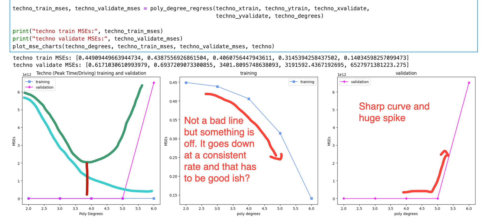
When combined with a basic graphing function, you end up with outputs like this. On the training and validation chart, I've added a dark green line for the ideal shape of validation and a light blue line for training. The red line would then be the ideal polynomial.
Cost Curve
Instead, I had a lot of outputs that looked like this, which isn't that bad but is impacted by high validation cost after the 5th degree. One goal is to minimize bias, which is where the cost is high for both and the model underfits the data. The other goal is to minimize variance, where the cost for training is low but the validation cost is high. High variance means that your model overfits the data and isn't generalizing well so the cost for data it hasn't seen before is high.

Multiple Polynomial Regression
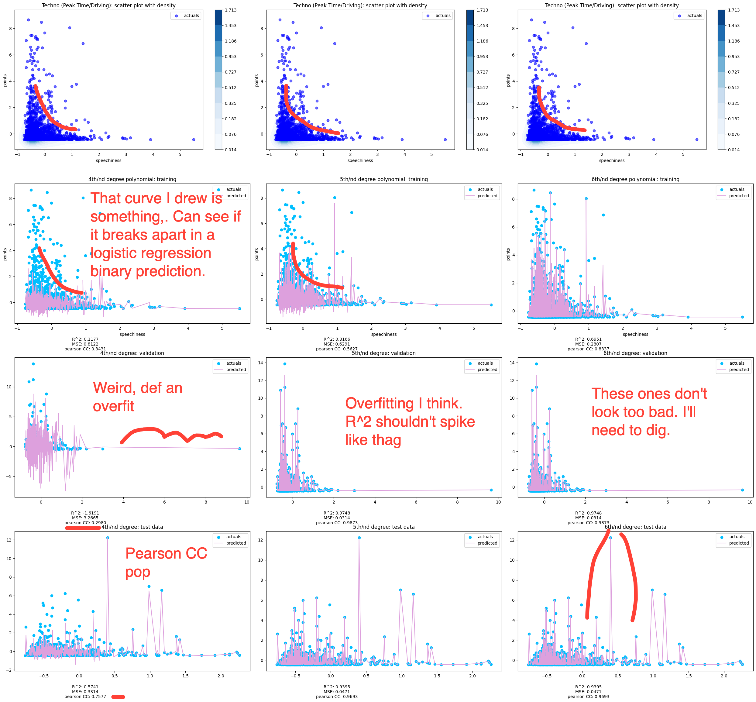
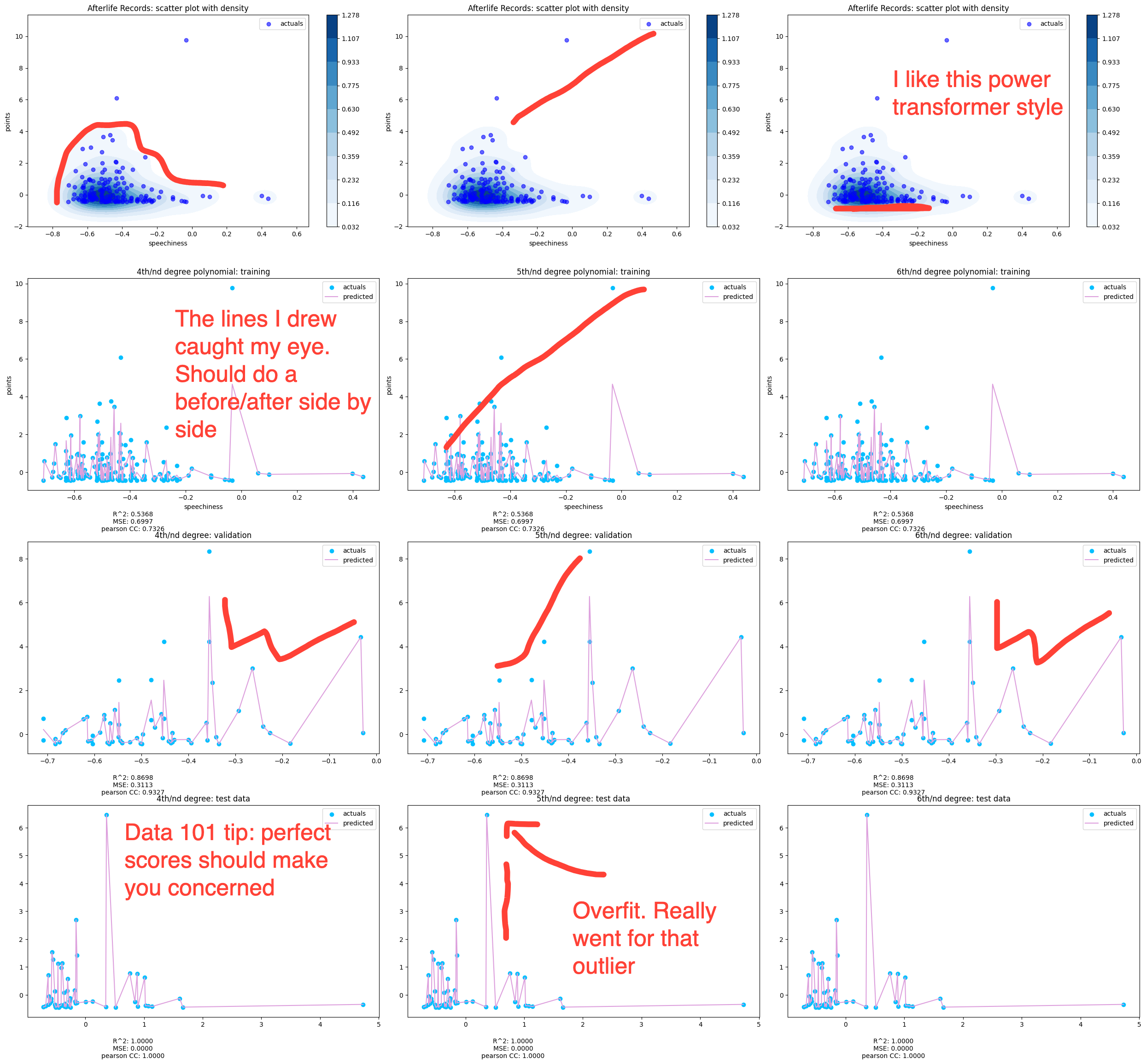
This function is a bit of a beast so I won't put the whole thing here. The function takes in all the data and a 3 value array for degrees and outputs four charts for each polynomial. The top one is jus a scatter plot of the the data and then the three below it are the fits for each data. Beneath each chart are the R^2, Mean Squared Errors, and Pearson. This one has a solid number of samples, as shown in the shape sizes. That's rows, columns. In the next one, you'll see the Afterlife label, which had a lot less samples.
```python
def poly_regress_plots(x_train, y_train, x_validate, y_validate, x_test, y_test, title_label, degrees)
This is standard scaled data. The density on the top charts continues to drive model behavior. All that dark blue means the fitting is just slamming around there, trying to find a fit.
Fitting was done using multiple x features and one y output with standard scaled data. The top chart is shaded based on density. The 2D charting of the fit is done using one x feature. Spotify's measure of spoken/sung words in a song. I'm focusing on it because, to prove or disprove my theory about a shift in the amount of lyrics in ll need to unpack the density.

Afterlife Label Power Transformed Polynomial Regression
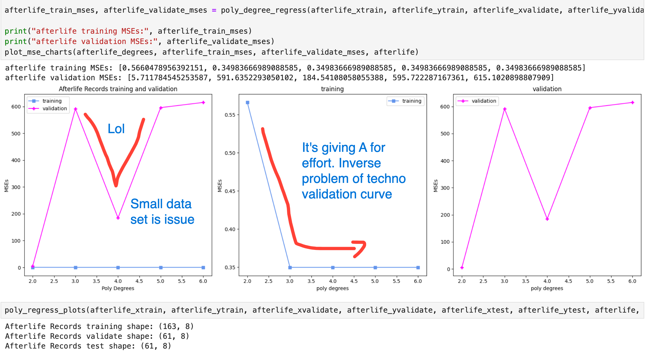
This is the same charting and regression functions, except applied to a label instead of a genre. Labels are naturally smaller subsets and you can see only 163 values in the training set.
Cost Curve

Multiple Polynomial Regression

